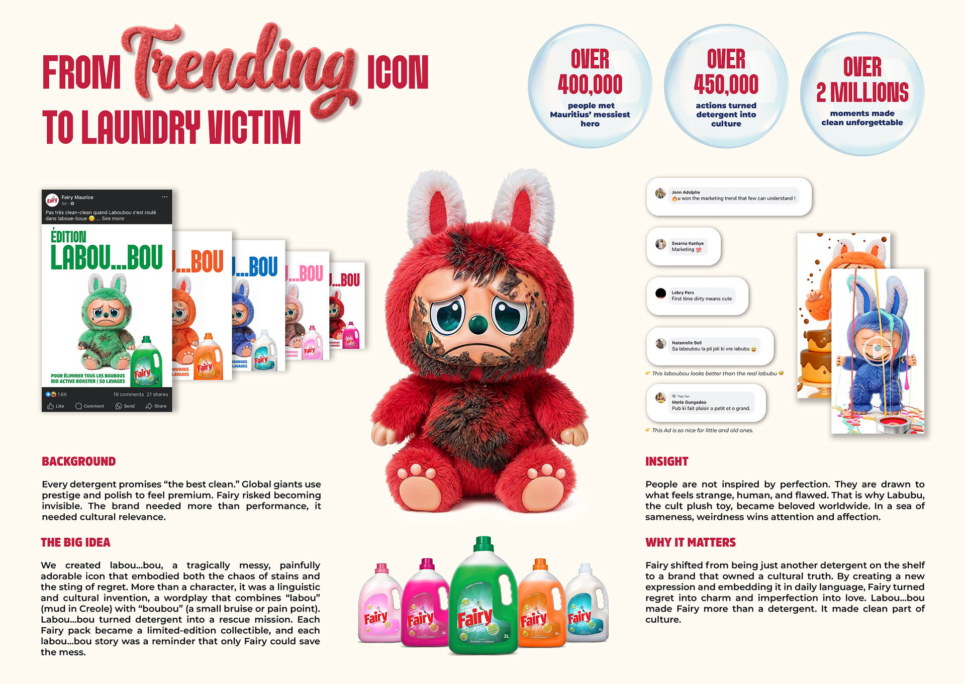
In a market where every detergent promises “the best clean,” Fairy risked blending into the background. Global giants were busy flaunting perfection, but perfection alone does not win hearts. Fairy needed something deeper, cultural relevance.
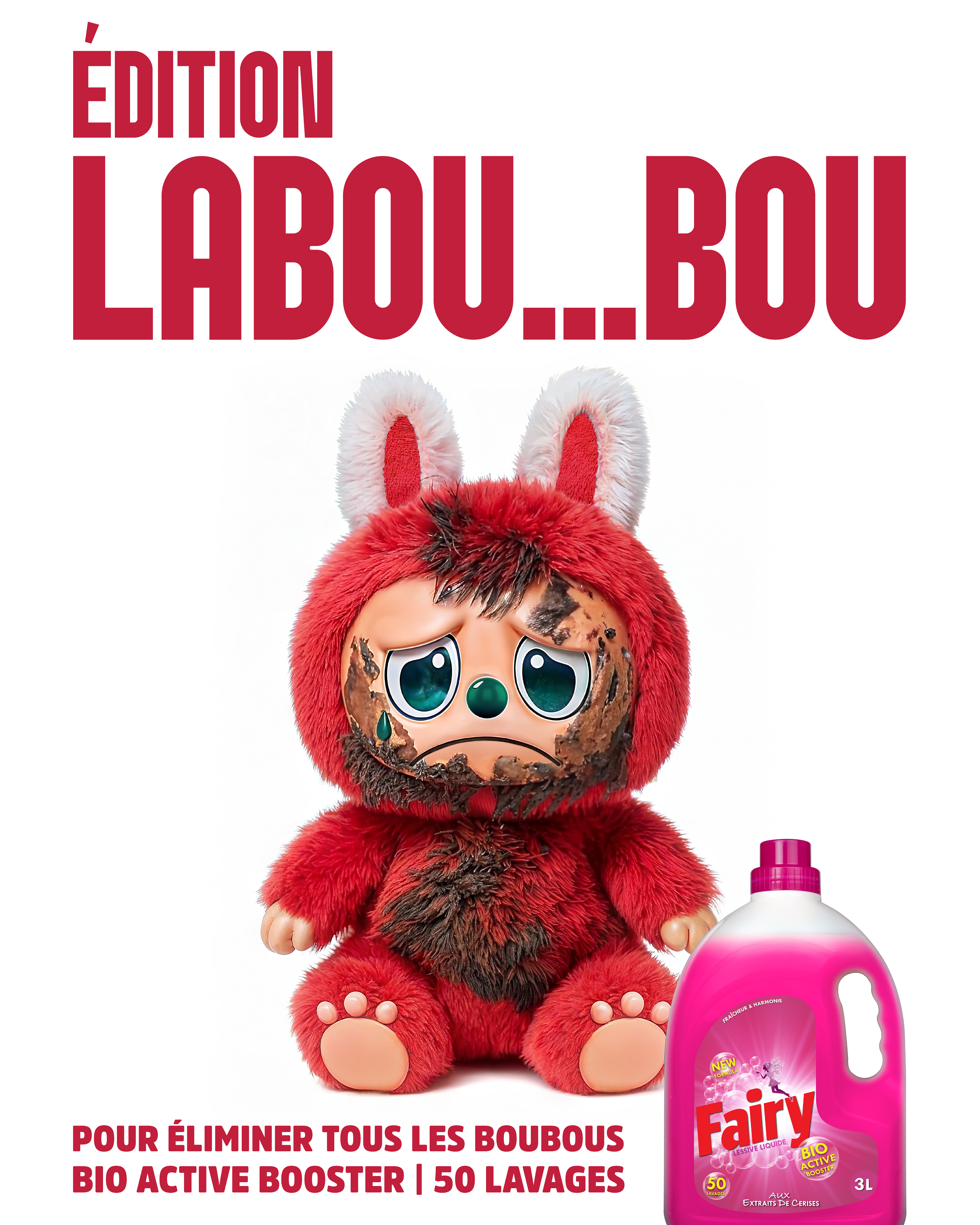
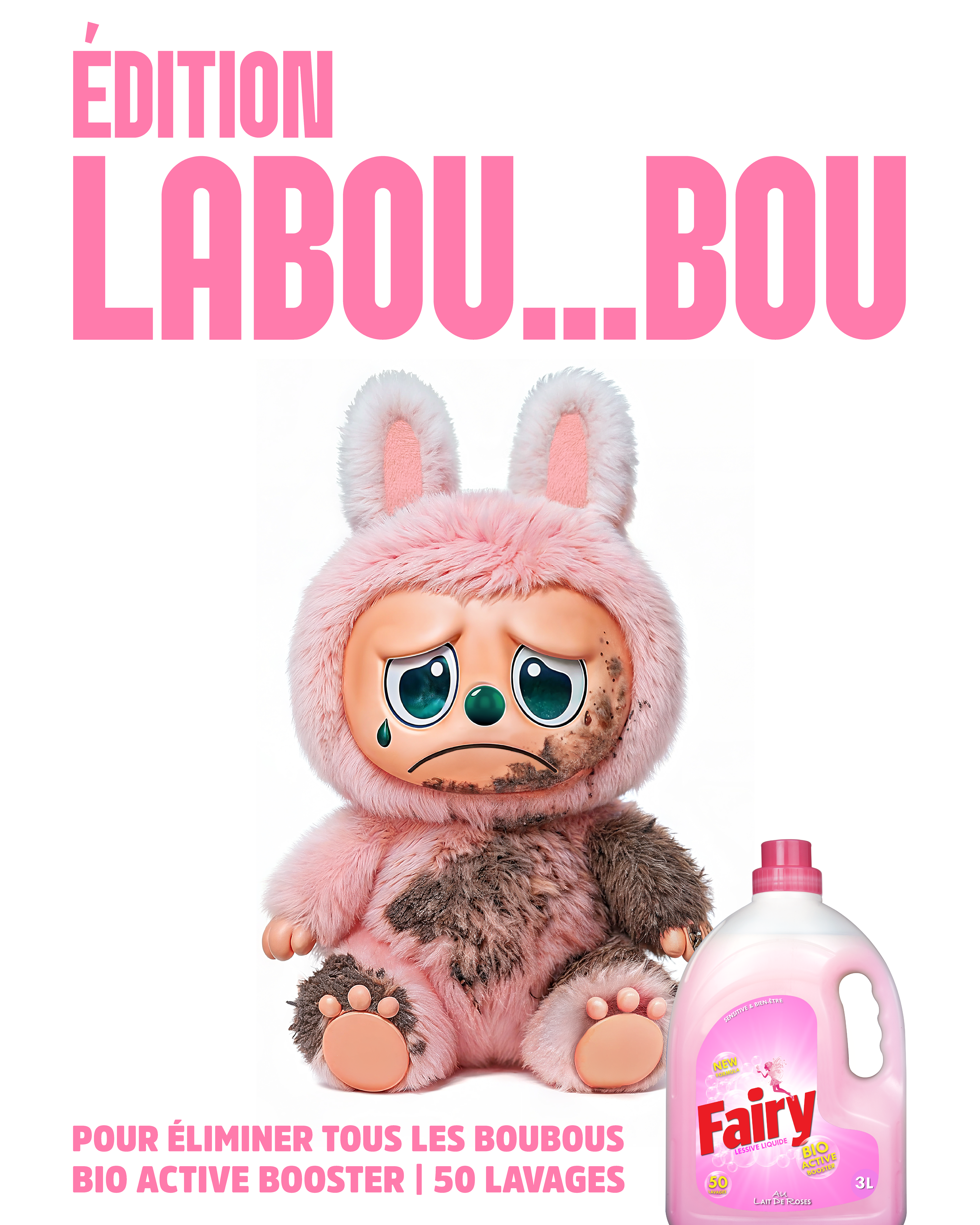
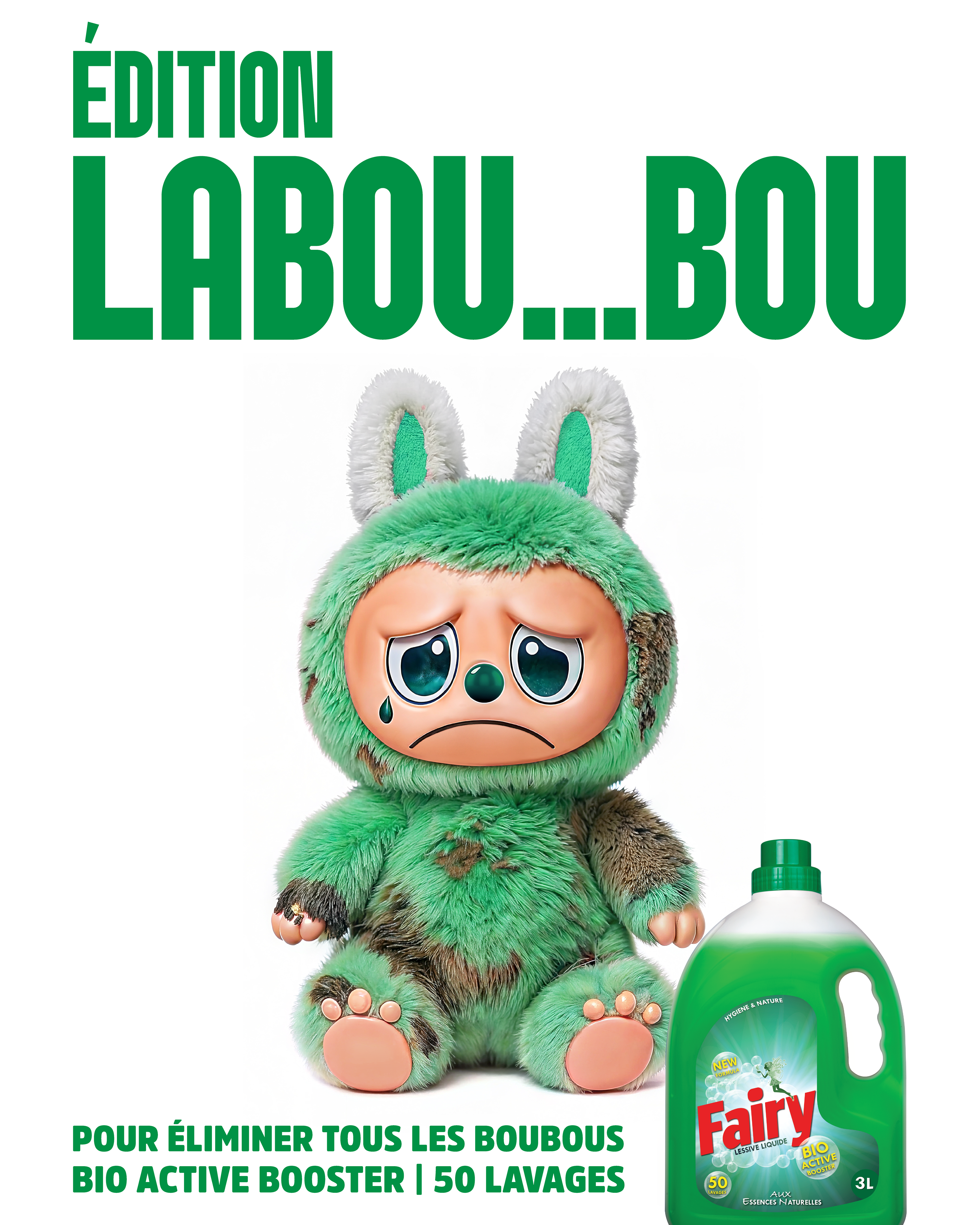
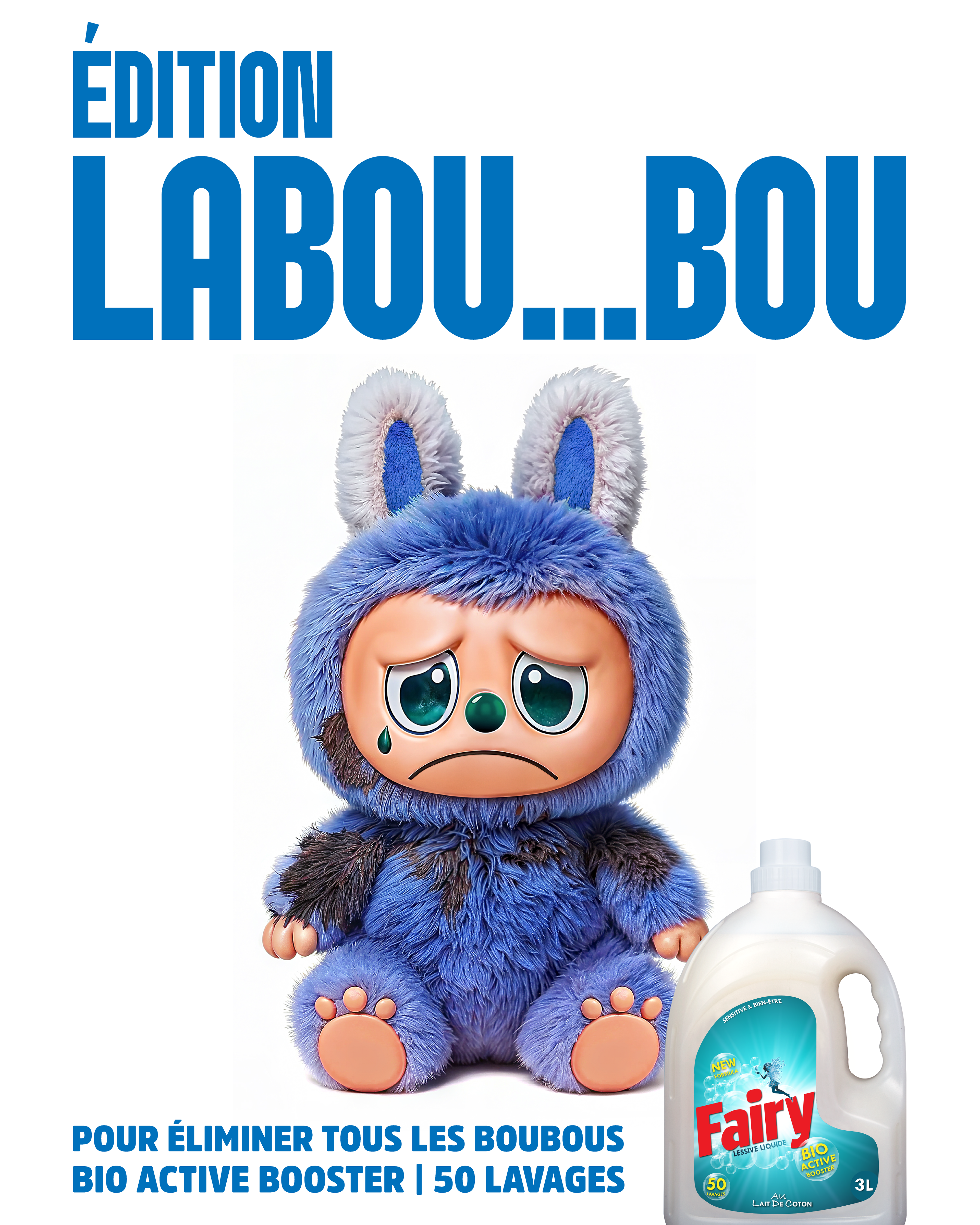
Enter Labou…bou. Inspired by Mauritius’ trending plush icon Labubu, we created its messy, tragic twin, a painfully adorable victim of everyday stains and regrets. The name itself was a linguistic twist, “labou” meaning mud in Creole fused with “boubou,” a small bruise or pain point. What emerged was a character that embodied both the chaos of dirt and the humour of local culture.
Each Fairy pack became part of this limited edition storytelling, reminding people that only Fairy could save Labou…bou from its stained fate. Social media lit up. Thousands engaged, laughed, and shared. The campaign turned detergent into a cultural talking point, with over 400,000 people meeting Mauritius’ messiest hero, 450,000 actions recorded, and over 2 million moments made unforgettable.
But more than numbers, Labou…bou made Fairy matter. By celebrating imperfection in a world obsessed with flawless surfaces, Fairy shifted from being just another detergent to becoming part of everyday language, humour, and culture. Fairy did not just clean stains, it cleaned its way into the hearts of Mauritians.
Credits
Advertising Agency: GREY Mauritius
Creative Director: Shane Seeam
Strategist: Lovish Tulloo
Art Director: Stephane Ramchurn
Senior Graphic Designer: Gerald Joomun
Copywriter: Jean Yvan Marechal / Bertrand Herisson
Creative Director: Shane Seeam
Strategist: Lovish Tulloo
Art Director: Stephane Ramchurn
Senior Graphic Designer: Gerald Joomun
Copywriter: Jean Yvan Marechal / Bertrand Herisson